MANIFESTO →
existing
is not the
same as
optimal.
Products inherit archetypes.
Packaging inherits structures.
Brands inherit visual codes.
Processes inherit habits.
Familiarity can make those decisions feel inevitable. We don't assume they are.
We question what exists, explore alternatives and make enough of the idea real to discover whether something better is possible.
Sometimes the conventional answer survives. Sometimes it doesn't.
That is where interesting design begins.
HOW WE SEE DESIGN →
ONE PRODUCT.
EVERY SCALE.
Products are experienced across different scales —
from the smallest graphic detail to the physical object itself.
We move between those scales because decisions made in one often influence the others.
01 / IDENTITY →
HOW IT SPEAKS.
Naming, typography, colour and visual language
create recognition and meaning.
02 / STRUCTURE →
HOW IT HOLDS TOGETHER.
Packaging, materials and construction determine how a product is protected, transported, presented and experienced.
03 / OBJECT →
HOW IT EXISTS.
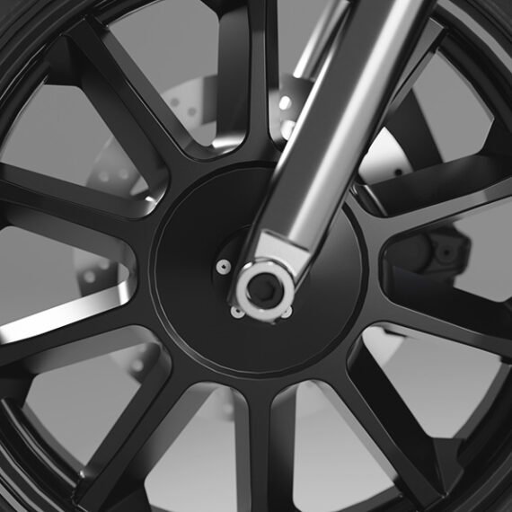
Form, proportion, ergonomics, materials, surfaces and detail create the physical character of the product.
Different scales. Same question: does it have to be this way?
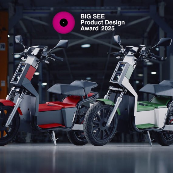
+ OBJECT / NOOS
DOES AN
ELECTRIC SCOOTER
HAVE TO
LOOK LIKE ONE?
When familiar categories develop familiar visual codes,
new products can become variations of the same answer.
For NOOS, we deliberately avoided imitating the bulky curves
and established styling language of the scooter category.
The goal was a clear, distinctive physical identity —
restrained, architectural and immediately recognisable as its own object.
External Design · Form Development · Scaled Clay Modelling · CMF · Brand Identity
WHY QUESTIONING MATTERS
DIFFERENCE SHOULD HAVE A REASON.
We are not interested in novelty for its own sake.
A different form, structure or process needs to create something worthwhile — clearer character, better use, less material, improved logistics, stronger recognition or a more meaningful experience.
The objective is not to be unusual. It is to find the answer convention may have hidden.
MAKE TO UNDERSTAND
UNLIKELY IDEAS NEED REAL FEEDBACK.
New concepts are easy to defend while they remain presentations. Physical reality is less polite.
It exposes proportion, fit, material, structure, interaction and assumptions.
That is why we make early.
QUESTION → PROPOSE → MAKE → CHALLENGE → REFINE ↻
+ THE LAB
FAIL EARLY.
LEARN CHEAPLY.
The safest time to take a creative risk is before engineering, tooling and production make change expensive.
Our in-house lab lets us investigate unconventional directions quickly and physically — through clay, CNC, additive manufacturing, structural packaging prototypes, thermoforming, scanning and CMF evaluation.
MAKE TO UNDERSTAND →
DESIGN BEYOND THE OBJECT
THE OBJECT
IS ONLY PART
OF THE SYSTEM
A design does not succeed in isolation.
It has to survive production, packing, transport, handling, retail, use and the requirements that govern each stage.
We bring logistics, real environments, testing and certification requirements into the design process early — working with certified laboratories, engineers, manufacturers and specialist partners where the project requires them.
Reality is not what happens after design. It is part of the brief.
+ STRUCTURE / VIUPAX
DOES A SHOEBOX
HAVE TO BE A BOX?
Viupax began by questioning one of the footwear industry's
most established packaging archetypes.
Instead of improving the conventional box incrementally, the project reconsidered
structure, material, volume, carrying, logistics and user experience as one system.
FLAT → FOLDED → CARRIED → NESTED → SHIPPED
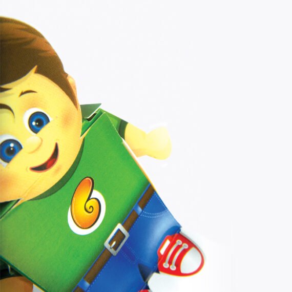
+ STRUCTURE / EXPERIENCE / STAFIDENIOS
CAN PACKAGING
BECOME PLAY?
Most packaging completes its purpose when the product is opened.
Stafidenios was designed to begin a second life instead. Its patented
folding structure transforms into playable objects, extending
the package into the experience itself.
OPEN → FOLD → TRANSFORM → PLAY
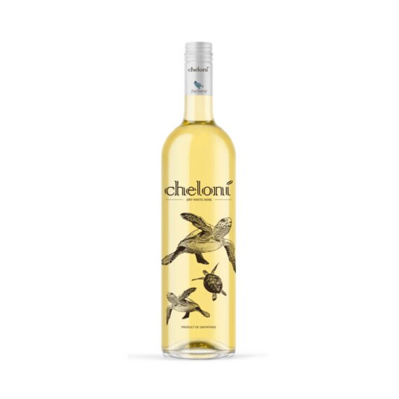
+ IDENTITY
DOES A CATEGORY
HAVE TO LOOK
LIKE ITS CATEGORY?
Brand conventions can become as repetitive as product archetypes.
We build identities from the idea outward — using naming, typography,
colour, graphic behaviour and custom systems to create recognition
without simply reproducing familiar category codes.
IDEA → NAME → LANGUAGE → SYSTEM → RECOGNITION
QUESTIONS WE'VE
MADE PHYSICAL.
+ STUDIO / MATADOG
SMALL BY
DESIGN.
Matadog has two designers at its core.
We stay close to the work because ideas lose clarity when
creative responsibility is endlessly handed from one layer to another.
Clients work directly with the people thinking, sketching, modelling,
challenging and refining the project. When specialist engineering,
manufacturing or production expertise is required, we build
the appropriate team around the work.
THE CORE STAYS SMALL. THE QUESTION CAN BE BIG.
RECOGNITION
GOOD QUESTIONS
SOMETIMES
GET NOTICED.
Recognition is useful evidence, but never the starting point.
The objective is to create work that deserves to exist — not work designed to win an award.
33 International Awards · 7 Patents · 1 Cannes Lions Shortlist · 16 Years
WHAT ARE YOU
TAKING FOR GRANTED?
A product form.
A packaging structure.
A manufacturing assumption.
A visual convention.
Bring us the challenge before the answer has already been decided.