
OBJECT → IDENTITY → STRUCTURE
_ INDUSTRIAL DESIGN \ BRANDING / PACKAGING

a product's shape
a brand's visual language
a package's structure
Some decisions are worth keeping. Others are simply inherited.
We design physical products, packaging and brand identities, exploring alternatives through sketches, models and prototypes and making enough of an idea real to challenge it.
a brand's visual language
a package's structure
Some decisions are worth keeping. Others are simply inherited.
We design physical products, packaging and brand identities, exploring alternatives through sketches, models and prototypes and making enough of an idea real to challenge it.
QUESTIONS WE'VE
MADE PHYSICAL.
MADE PHYSICAL.

NOOS
Branding, Brochure design
RIM
Automotive, Product Design
Chelloni
Packaging
Psaradellis
Branding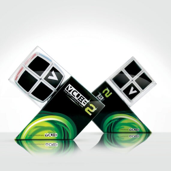
V-Cube No2, No3, No4
Branding, Packaging, Structural Packaging
Stafidenios
Branding, Packaging, Product Design, Structural Packaging
Viupax
Branding, Product Design, Structural Packaging, Sustanability
_ OBJECT | NOOS
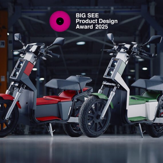
For NOOS, we questioned the bulky curves and familiar styling of the scooter category.
We developed a restrained, architectural form, using proportion, surfaces and detail to give the vehicle a distinctive physical identity. Scaled clay modelling brought those proportions off the screen, where we could examine and refine them.
Our work connected the object and its identity, from external design to branding.
External Design · Form Development · Scaled Clay Modelling · Colour, Materials & Finish · Brand Identity

/ STRUCTURE | VIUPAX
Viupax began by questioning one of the footwear industry's most established packaging archetypes.
Instead of improving the conventional box incrementally, the project reconsidered
structure, material, volume, carrying, logistics and user experience as one system.
· THE DIELINE AWARDS — 3rd Place
· A’ DESIGN AWARD — Iron Award FLAT → FOLDED → CARRIED
NESTED → SHIPPED
TESTED TO ISTA 3A — PASSED
Millennium Printing · ISTA Certified Testing Laboratory
\ IDENTITY — BRAND DESIGN
DOES A CATEGORY
HAVE TO LOOK
LIKE ITS CATEGORY?
Brand conventions can become as repetitive as product archetypes.
We build identities from the idea outward — using naming, typography,
colour, graphic behaviour and custom systems to create recognition
without simply reproducing familiar category codes.
We question what exists, explore alternatives and make enough of the idea real to discover whether something better is possible. Sometimes the conventional answer survives. Sometimes it doesn't.
Either way, the decision has a reason.
+ HOW
WE SEE DESIGN
WE SEE DESIGN
ONE PRODUCT.
EVERY SCALE.
EVERY SCALE.
The object, the packaging and the identity shape how a product is experienced.
A decision in one can open possibilities in another.
We work across all three.
Commission us for an individual discipline or bring them together in one project.
A decision in one can open possibilities in another.
We work across all three.
Commission us for an individual discipline or bring them together in one project.
01 _ OBJECT →
HOW IT EXISTS.
Industrial design for new concepts and existing products.
We explore form, proportion, ergonomics, materials and detail through sketches, digital models and physical prototypes.
We explore form, proportion, ergonomics, materials and detail through sketches, digital models and physical prototypes.
02 \ IDENTITY →
HOW IT SPEAKS.
Brand identities for businesses and products.
We develop naming, typography, colour and visual systems, creating a consistent language across packaging, print and other brand applications.
We develop naming, typography, colour and visual systems, creating a consistent language across packaging, print and other brand applications.
03 / STRUCTURE →
HOW IT HOLDS TOGETHER.
Packaging design across structure and graphics.
We consider how a product is protected, transported, presented and opened, developing construction and visual identity together.
We consider how a product is protected, transported, presented and opened, developing construction and visual identity together.
Different scales. Same question: does it have to be this way?
+ THE IN-HOUSE LAB
PHYSICAL REALITY
An idea can look convincing on a screen. Make it, and the questions get specific.
Does the proportion feel right? Does the part fit? Does the package open as intended? What happens when someone picks it up?
Our in-house lab brings that feedback into the design process early, before tooling and production make changes expensive. Clay modelling, CNC milling, 3D printing, thermoforming, 3D scanning and packaging prototyping allow us to examine form, structure and interaction.
For colour, material and finish development, physical plastic colour and grain references—supported by spectrophotometer and glossmeter measurement—help us compare colour, texture and gloss with greater precision.
You can see, handle and assess the direction while there is still room to change it.
PHYSICAL REALITY
IS LESS POLITE.
An idea can look convincing on a screen. Make it, and the questions get specific. Does the proportion feel right? Does the part fit? Does the package open as intended? What happens when someone picks it up?
Our in-house lab brings that feedback into the design process early, before tooling and production make changes expensive. Clay modelling, CNC milling, 3D printing, thermoforming, 3D scanning and packaging prototyping allow us to examine form, structure and interaction.
For colour, material and finish development, physical plastic colour and grain references—supported by spectrophotometer and glossmeter measurement—help us compare colour, texture and gloss with greater precision.
You can see, handle and assess the direction while there is still room to change it.
QUESTION → PROPOSE → MAKE → CHALLENGE → REFINE ↻
+ BEYOND
THE OBJECTREALITY IS
A design has to survive production, packing, transport, handling, retail and use. We consider those demands as the idea develops.
Materials, construction, logistics and testing requirements all help determine which direction is worth pursuing.
Where a project requires specialist engineering, manufacturing or certification expertise, we work with the appropriate partners.
Understanding the constraints early gives us a clearer basis for the next design decision.
THE OBJECT
REALITY IS
PART OF THE
BRIEF.
A design has to survive production, packing, transport, handling, retail and use. We consider those demands as the idea develops. Materials, construction, logistics and testing requirements all help determine which direction is worth pursuing.
Where a project requires specialist engineering, manufacturing or certification expertise, we work with the appropriate partners.
Understanding the constraints early gives us a clearer basis for the next design decision.
+ STUDIO / MATADOG
SMALL BY
DESIGN.
Matadog has two designers at its core.
You work directly with the people
questioning the brief, sketching alternatives,
making models and refining the details.
That keeps communication direct and creative
responsibility clear as your project develops.
When specialist expertise is needed,
we build the appropriate team around the work.
+ RECOGNITION
GOOD QUESTIONS SOMETIMES
Recognition is useful evidence, but never the starting point.
The objective is to create work that deserves to exist — not work designed to win an award.
33 International Awards · 7 Patents · 1 Cannes Lions Shortlist · 16 Years
GOOD QUESTIONS SOMETIMES
GET NOTICED.
Recognition is useful evidence, but never the starting point.The objective is to create work that deserves to exist — not work designed to win an award.
33 International Awards · 7 Patents · 1 Cannes Lions Shortlist · 16 Years


+ CLIENTS &
COLLABORATORSGOOD QUESTIONS



COLLABORATORS
GOOD QUESTIONS
NEED THE RIGHT PEOPLE.
WHAT ARE YOU
TAKING FOR GRANTED?
A product form?A packaging structure?
A manufacturing assumption?
A visual convention?
Whether you have an early concept, a detailed brief or an existing design to improve, tell us what you're working on.
We'll discuss your goals, your constraints and where we could contribute.