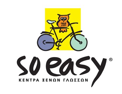
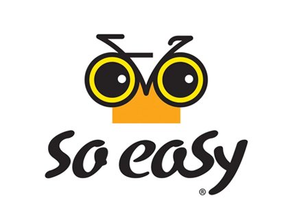
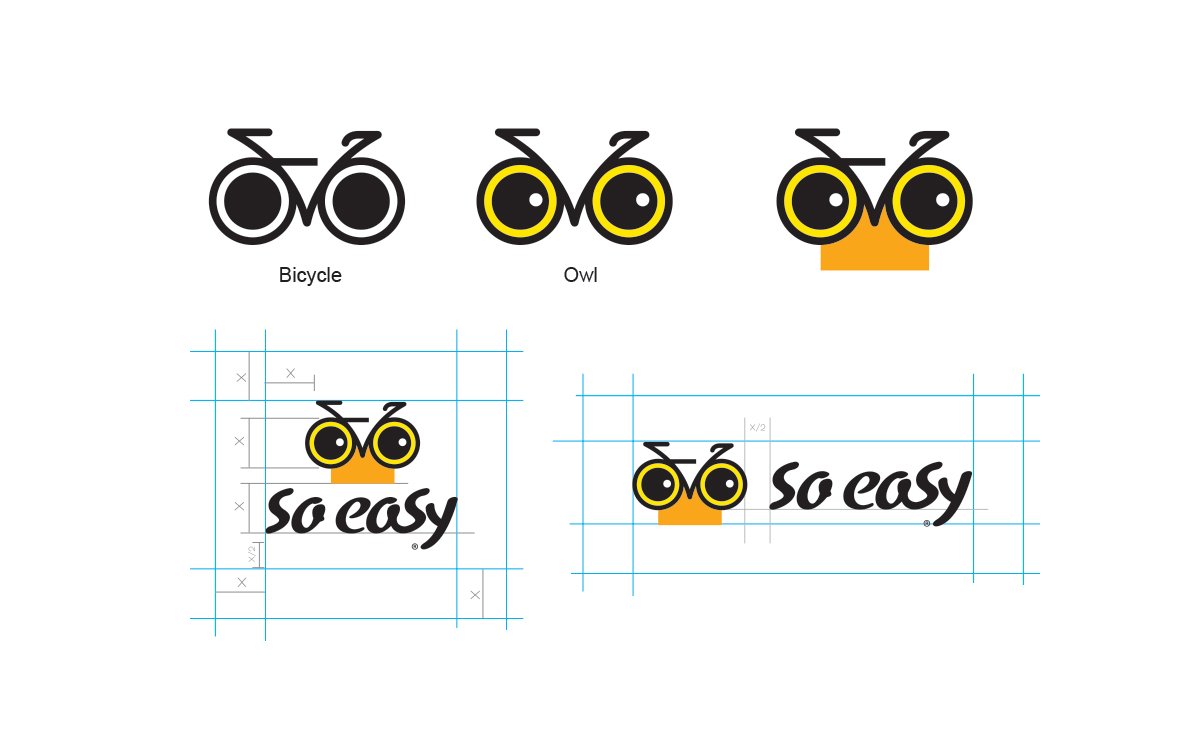
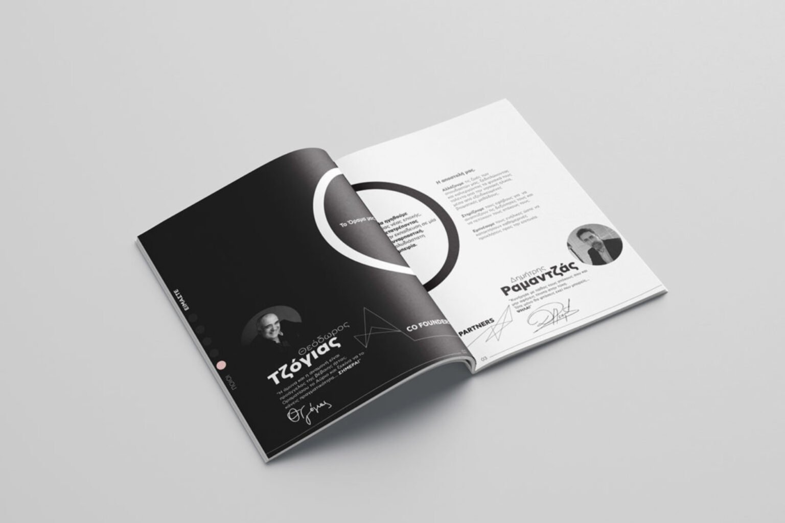
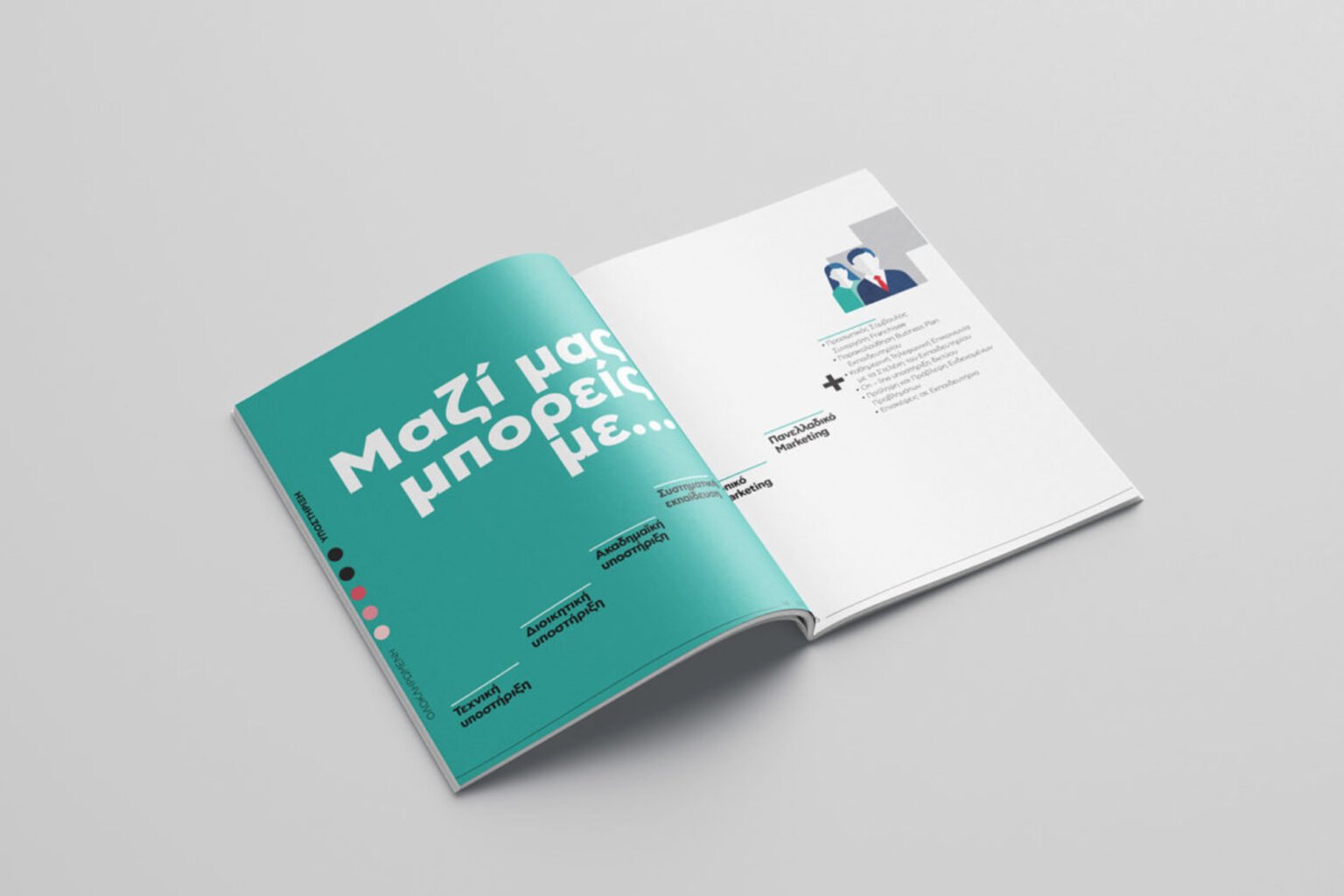
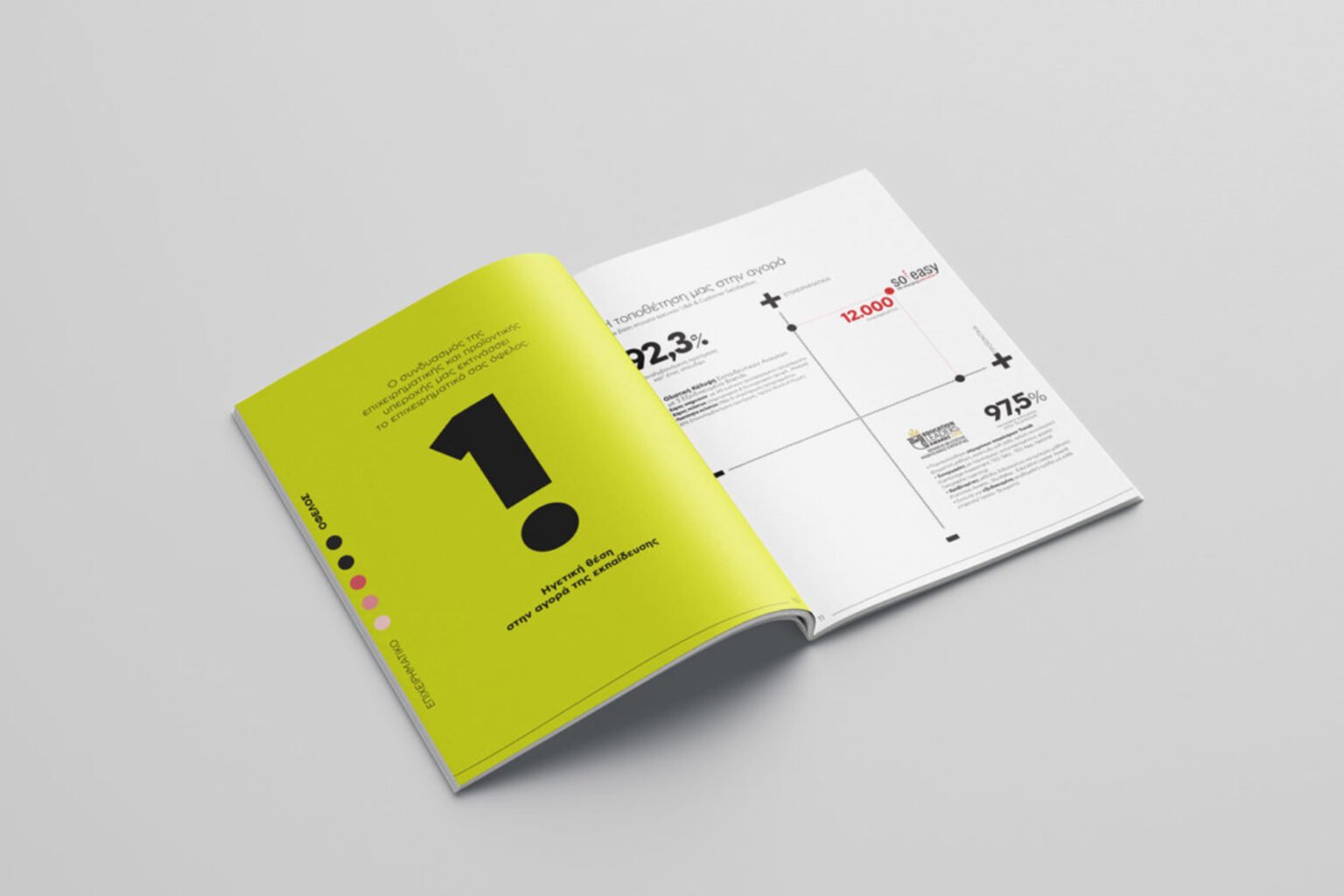
Matadog undertook the redesign of So Easy, a language learning center specializing in foreign languages. The previous logo featured an owl riding a bicycle in a sketchy style, with a typeface that was overly aggressive for children. Our solution involved creating a new brand identity centered around the owl, symbolizing knowledge, with lines subtly forming the shape of a bicycle in a minimal and elegant manner. The “So Easy” typeface was also redesigned to be more approachable and suitable for a younger audience. The project was a success, validated by positive research results. Matadog extended the new identity to communication materials such as brochures, ensuring consistency and appeal across all touchpoints.